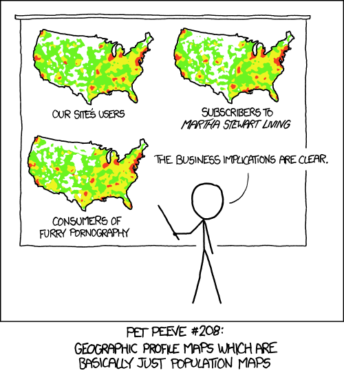
You may think your data look like this
## What does that mean
* Come with questions
* Know their bias
* Who collected this? For what?
* How sure are they?
* Can't rely only on the data
More likely, your data are this
## Quick bath
* Take a min, max, sum and average
* Sort and scan
* Missing values
* Change things around
* Text to columns
* Convert to numbers, dates, text as needed
* Pivot tables
## Data smells
* Talk to the people who collect the data
* Get the documents behind the data
* Check previous years
* Row numbers
* Excel row limits
* Round numbers
* Sample size
* Null Island
## Make your life easier
* Create a data dictionary
* Make a copy of the original
* Don't make changes in a cell, create a new column
* Track your changes
## Before you start
* Know your data
* What is the [purpose of your visualization](http://junkcharts.typepad.com/junk_charts/junk-charts-trifecta-checkup-the-definitive-guide.html)?
* What are your users likely to take away?
* Make a sketch (or many)
## Types of charts
* Why is this not a bar chart?
* Comparisons
* Bar charts, line graphs, slope graphs
* General trends
* Area (bubbles, pies), shades
## Design
* Clarify, not simplify
* Limit colors, fonts
* Interactivity
* Overview first, zoom and filter, then details-on-demand
* What is the purpose (what will your users to get out of it?)
## Tools
* [Chartbuilder](https://quartz.github.io/Chartbuilder/)
* [Tableau](http://www.tableau.com/products/public)
* [High Charts](http://www.highcharts.com/)
* [Google Charts](https://developers.google.com/chart/)
## When is [a map a map](http://www.ericson.net/content/2011/10/when-maps-shouldnt-be-maps/)
* The geography is key to the story
* The interesting trends are tied to the geography
* That story is clear in the presentation
* Showing those trends on a map is the clearest way to present them
* Geography [doesn't distort the data](https://medium.com/@joshuatauberer/how-that-map-you-saw-on-538-under-represents-minorities-by-half-and-other-reasons-to-consider-a-4a98f89cbbb1#.7wjk8uvoz)
## Tools
* [CartoDB](https://cartodb.com/)
* [Google Fusion Tables](https://support.google.com/fusiontables/answer/2527132?hl=en&topic=2573107&ctx=topic)
* [ESRI Story Maps](http://storymaps.arcgis.com/en/)
* [Leaflet (Maptime Tutorial)](http://maptime.io/chicago/learn-leaflet/#0)
* [MapBox](https://www.mapbox.com/)
## Resources
* [How to 'interview' a big pile of data](http://training.npr.org/visual/what-to-do-with-a-big-pile-of-data/)
* [The Quartz Guide to Bad Data](https://github.com/Quartz/bad-data-guide)
* [When to use maps in data visualisation: a great big guide](http://onlinejournalismblog.com/2015/08/24/when-to-use-maps-in-data-visualisation-a-great-big-guide/)
* [The Functional Art](http://www.thefunctionalart.com/)
* [ProPublica Guide to bulletproofing your data](https://github.com/propublica/guides/blob/master/data-bulletproofing.md)
* [Poynter's Excel for journalists](http://www.poynter.org/news/media-innovation/154584/how-journalists-can-use-excel-to-organize-data-for-stories/)
* [IRE and NICAR-L](www.ire.org)
## Lab
* [Download Chicago City salaries dataset as csv (Comma Separated Values)](https://data.cityofchicago.org/)
* Load the file into Google Sheets
* Who's the highest/lowest paid employee? Anything intersting about that?
* Use a pivot table to find the department spending the most on salaries. Chart the top 10 in your tool of choice.
* Find one other interesting thing that might be a story. Post that and your chart to this week's slack.
* Stuck? Refer back to "How to 'interview' a big pile of data" on the prevous slide.


